04 / 13
2020
This project is the renovation of an office building in the headquarters of Chengyuan Garment, approached by Masanori Designs...
Design Firm: Lucien Organization - Masanori Designs
Location: Zhongshan, China
Year: 2019
Area: 285 sqm
Chief designer: Terry Xu
Design team: Huang Zuanquan, Huang Weiqi, Dai Jiahuan
Construction drawing detailing: CHL
Decoration design: Lucien Soft Decoration
Photography: Ouyang Yun
From the architect: Chengyuan Garment is a Chinese OEM company specializing in manufacturing young people's fashionable apparel, which is located in Shaxi Town — the garment processing and production base of Zhongshan, Guangdong.
This project is the renovation of an office building in the headquarters of Chengyuan Garment, approached by Masanori Designs. The business owner is a young entrepreneur. She hoped that the renovated building could satisfy more functional demands, fit the trend of the times, rejuvenate the factory, and convey the company’s brand management philosophy of advancing with the times and pursuing quality and internationalization.
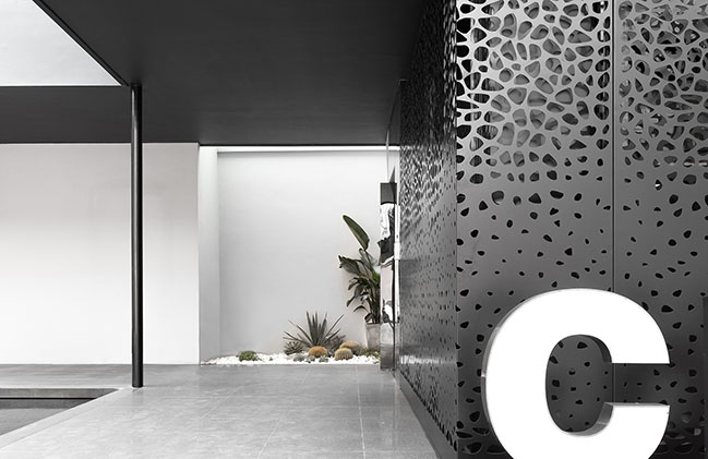
Difficulties in renovation
Environmental creation - The factory area is small and lacks landscape, so the first consideration should be the creation of natural environment.
Architectural renovation - The old look of the 20-year-old factory building was far away from meeting the current functional demands and aesthetic trends.
Spatial reconstruction - There was a lack of integrity among interior spaces and levels, which couldn't meet the requirements of office use.
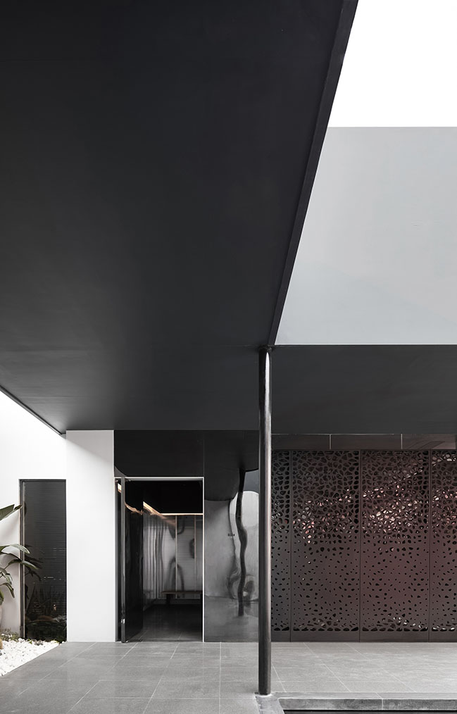
Landscape creation
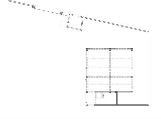
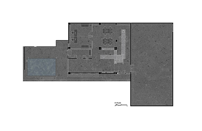
The factory area where the office building is located is small, and there was originally no greenery. During the renovation, Masanori Designs created a micro landscape formed by a pool, a fountain, green plants and a stone bench. By recreating ecological environment on the site, the designers built connection between the factory and nature and injected new vitality into it.
They demolished the iron parking shed on one side of the office building, and then brought natural landscape and artistic aesthetic in, forming a visually pleasing view. It adds tranquility to the factory environment, and provides a place for people to escape from the daily noise, relax and get close to nature.
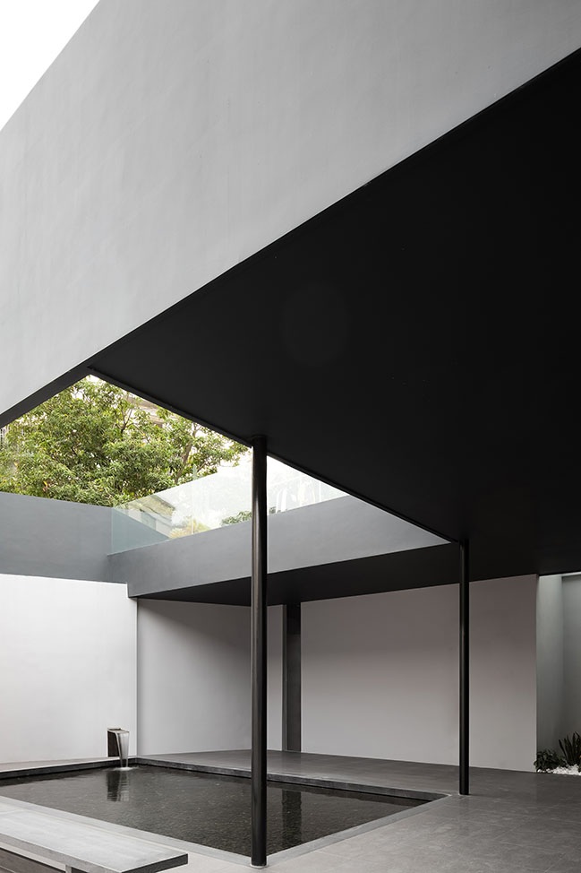
A fountain flows through the wall and rushes into the square pool, full of rhythm. Green plants are interspersed within this area, and the rectangular gray stone stool echoes the straight lines of the pool, together producing an enchanting scene. The simple color palette harmoniously integrates with the neat lines of the architecture, which generates a soothing and calming ambience.
In order to subtly integrate the landscape into daily life, the designers didn't adopt a traditional entrance path to the office building. They set the entrance on the left side of the building. Before entering into it, people must pass through the entrance and then traverse the pool landscape, so that they can immerse themselves into the tranquil natural view and obtain inner peace.
Architectural renovation
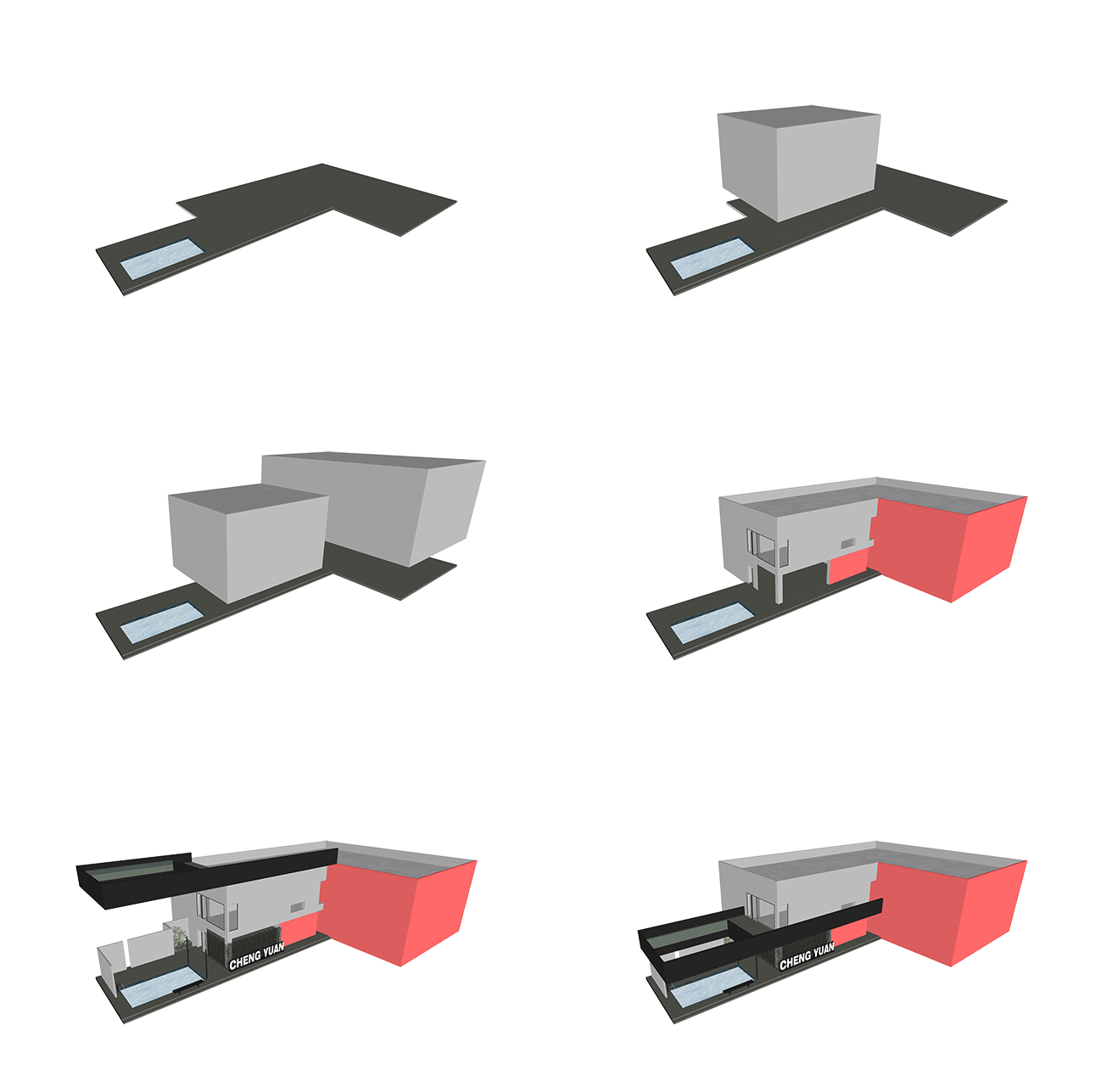
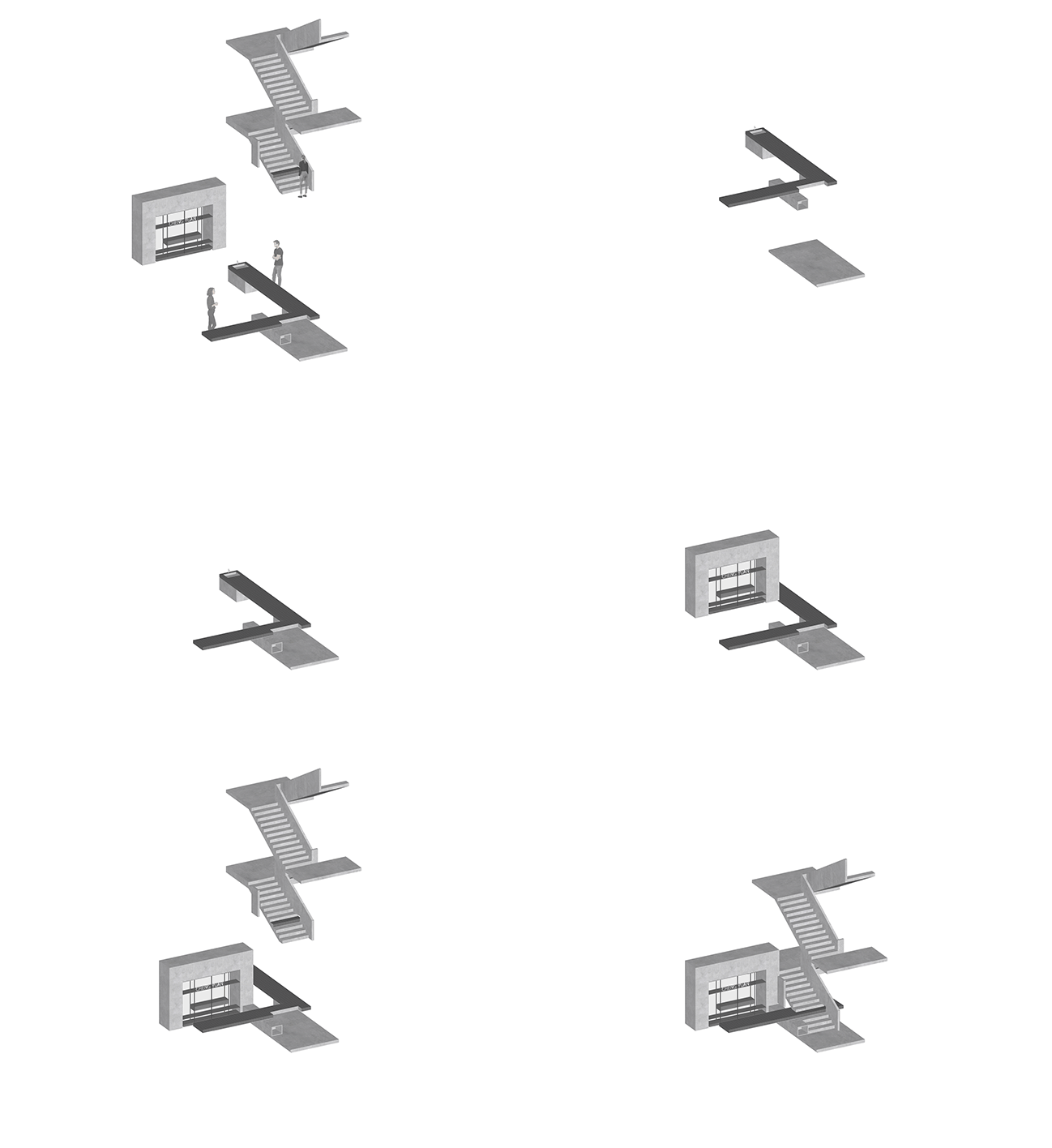
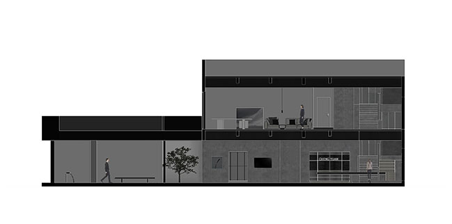
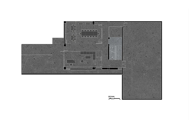
The entrance of 1F is connected to the pool by an L-shaped walkway, above which a same-shaped terrace was added. In this way, the walkway on 1F was turned into a landscape veranda. The floor slabs and the fence of the 2F terrace utilized the same color as the ceiling of the entrance space on 1F, which forms a building block with a sense of volume and lends a visual depth.
The L-shaped terrace and the fence enclose an open-air atrium, so that the natural landscape on the first floor can be shared with the second floor, and hence the spatial structure becomes more transparent. In addition, the terrace also allows more natural air to filter into the interior space on 2F.
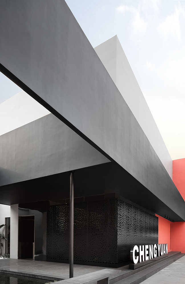
On the outside of the L-shaped terrace, a black steel plate extends from the main body of the building to the end of the pool and meets with the L-shaped terrace to form a hollow square. The original building, the newly built terrace and the pool are combined into a whole, presenting the architectural beauty of integrity. The appearance and temperament of overall architecture are in line with international aesthetic fashion.
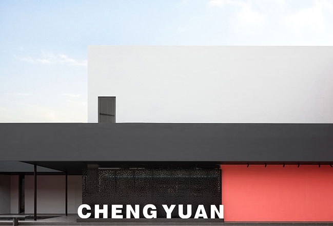
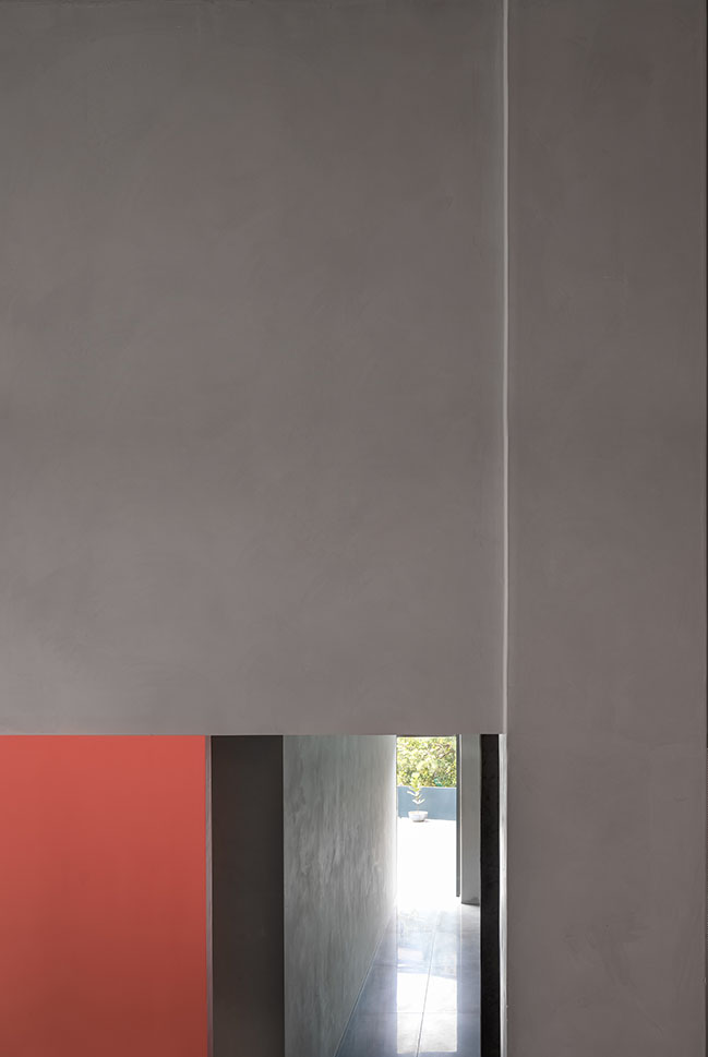
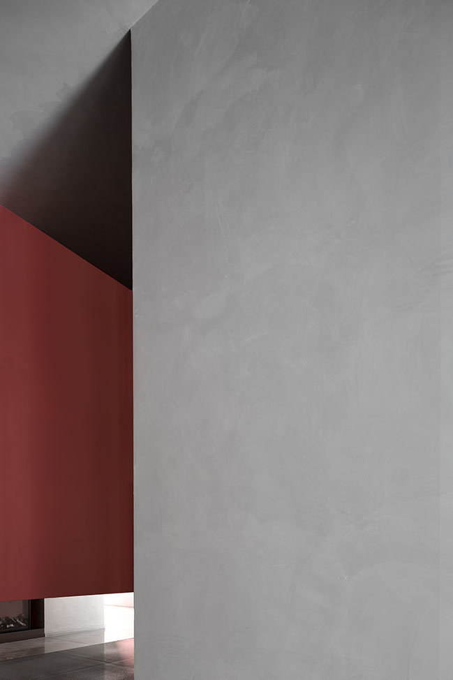
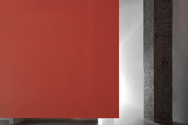
The exterior walls are finished with dark gray and coral red paint, which generates a contrasting, dynamic and stylish visual effect. Different color blocks correspond to different functional zones, and the large colored surfaces highlight the architecture's sense of volume. The architectural appearance shakes off the traditional image of manufacturing companies, which is stylish, more like an "art factory". The building stands out in the surrounding built environment, and conveys the company's spirit of advancing with the times and fashion taste.
Spatial reconstruction
Space - There is a transitional space from the outside to the interior, which enables the brief serenity brought by the outside landscape to continue into the space. Designed with the concept of “dressing room”, it has the features of a trendy clothing space and also provides fun sensory experiences.
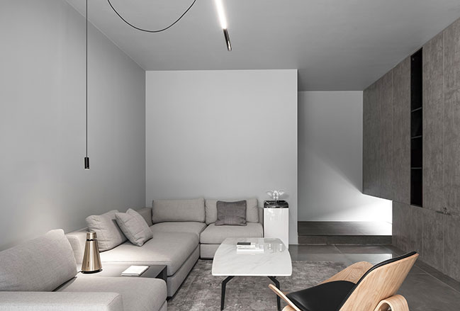
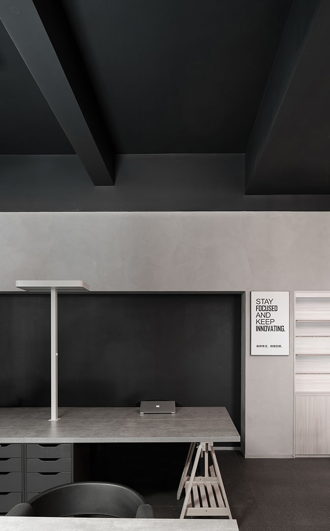
The office area accommodates multiple functions such as working and display in an open layout, and has a clear circulation route that links all functional divisions. Simplistic and tasteful office furniture fits into human scale, and enables the company to keep up with trendy international aesthetics.
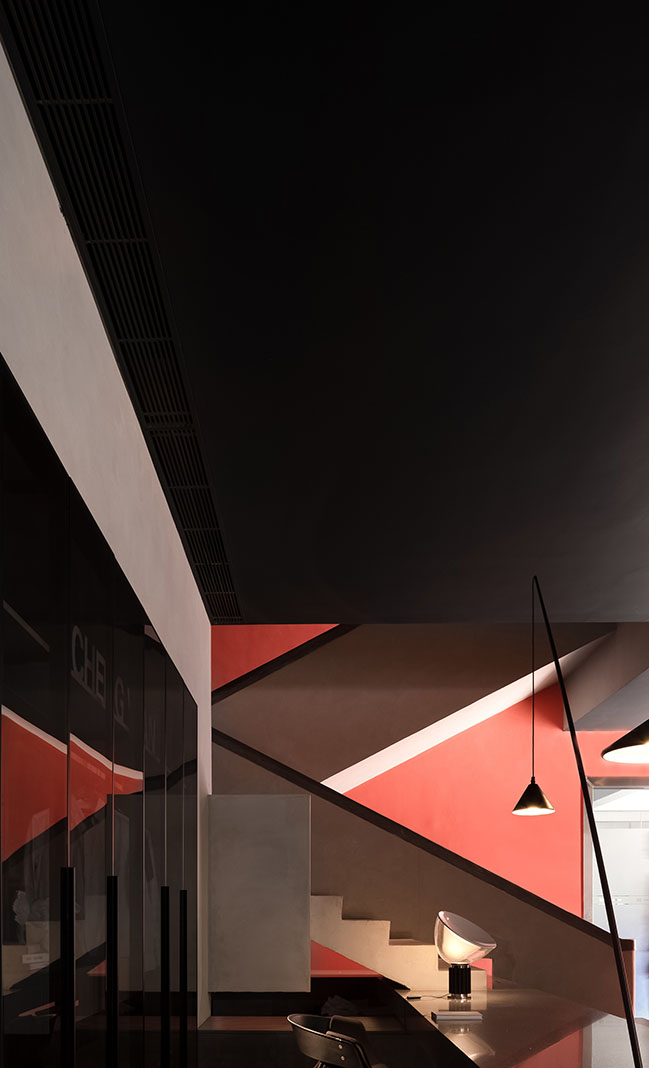
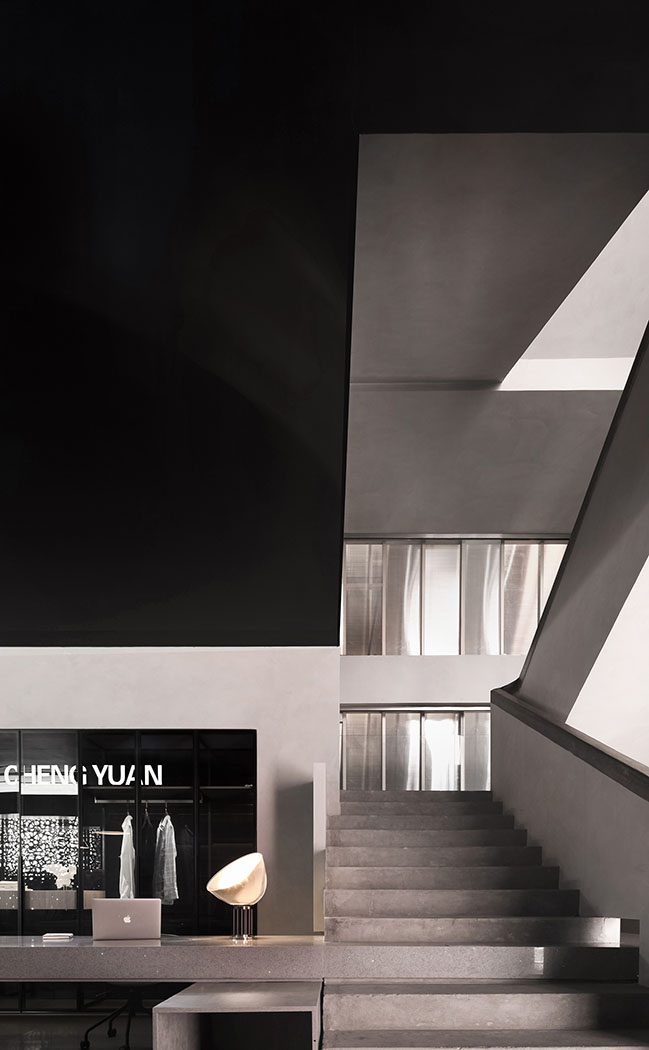
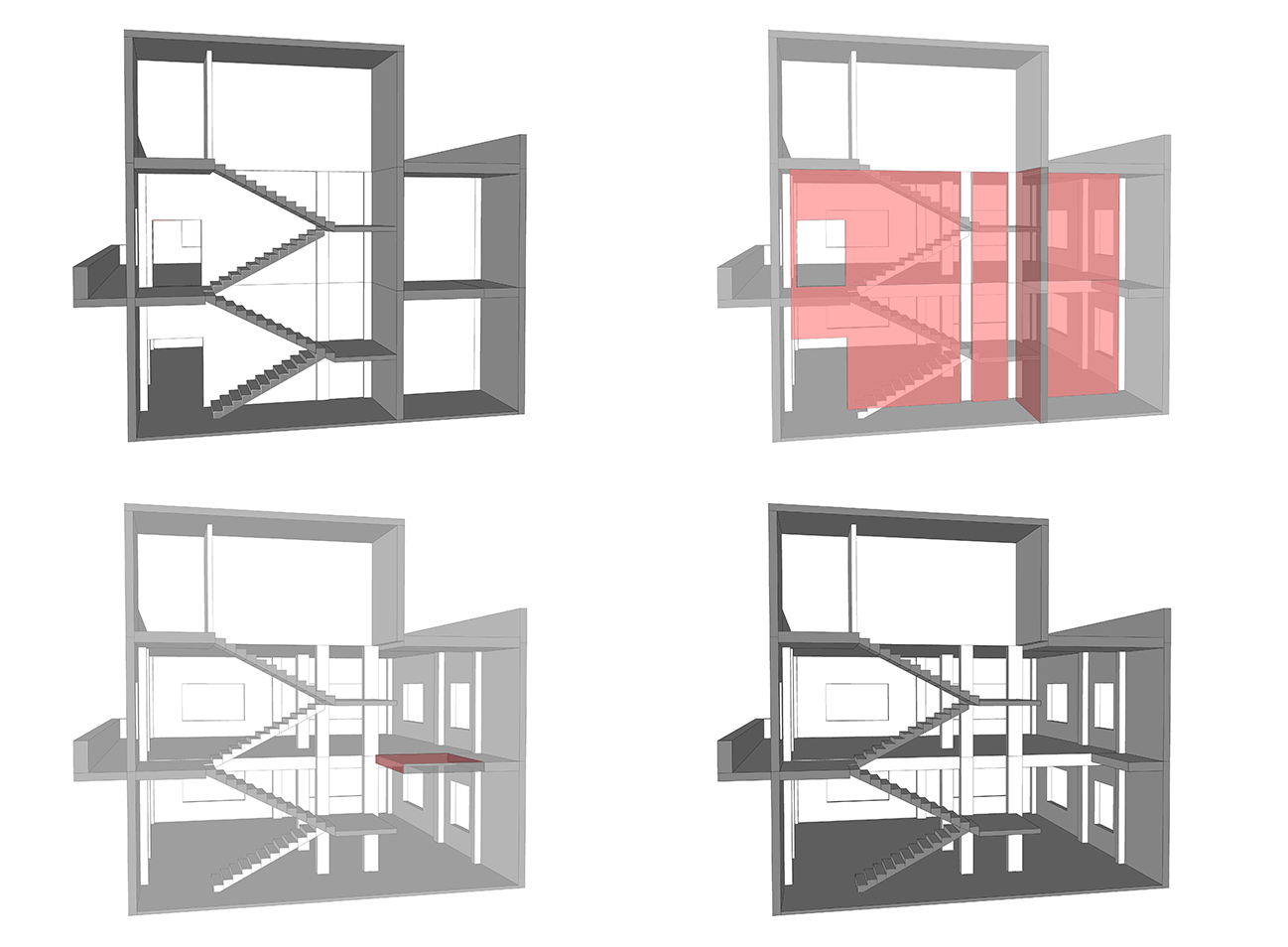
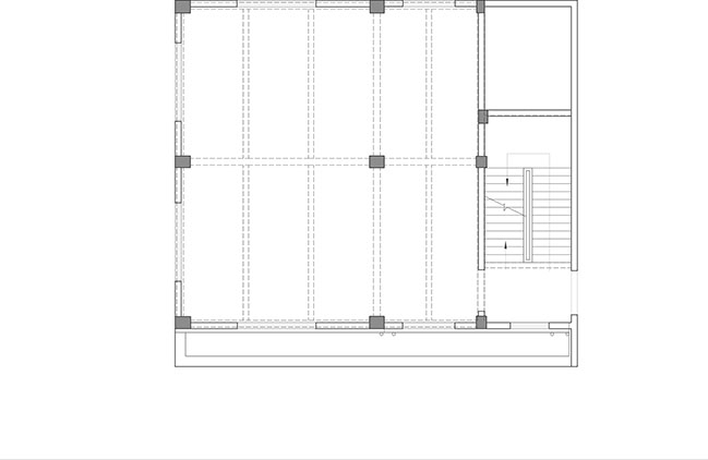
The vertical spatial relationship was also rearranged. The stairs were originally enclosed by a staircase hall, which made the space of 1F and 2F relatively separated. In order to change this, the designers demolished the walls enclosing the staircase, so that it was blended into the space in an open manner, becoming an important corner of the entire space.
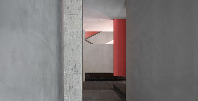
Meanwhile, the floor behind the stairs was opened to form an imposing hollow space and thereby to make the interior spaces of the two floors blend into one, which creates a refreshing spatial experience with a rich sense of rhythm.
In addition, the staggered interior surfaces and varying light also make experiences in the space unique.
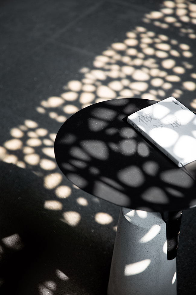
Light - Light is the breath of nature. The enclosed structure of the original building was opened to maximize the introduction of natural light into the interior, which subtly turns the daylight into a natural interior decoration as well. The light changes throughout the day and interacts with the architectural space, generating a comfortable, free and natural ambience.
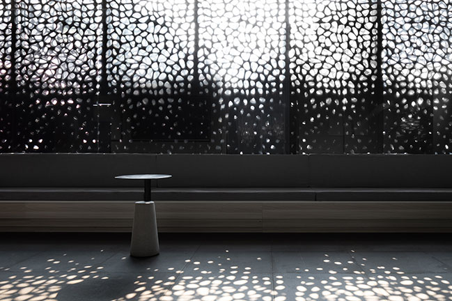
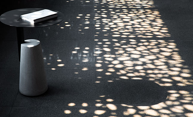
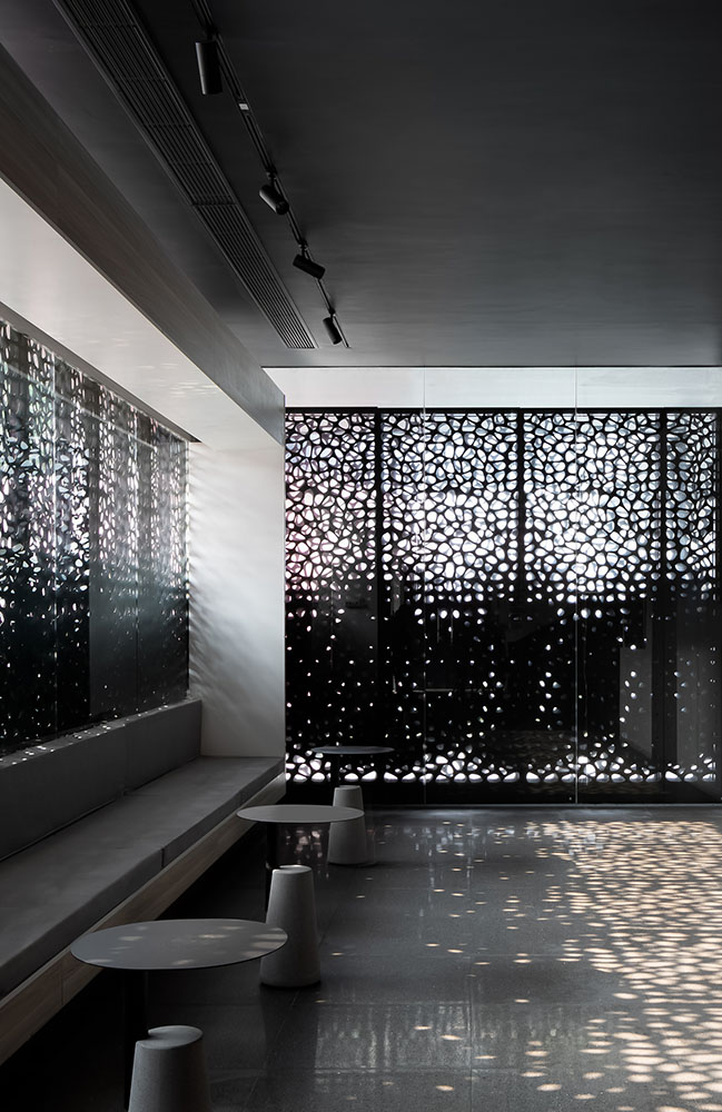
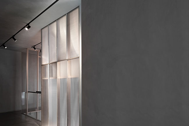
The public negotiation area is close to the front desk. Its original exterior walls were removed and replaced with perforated aluminum sheets. From bottom to top, the size of holes on the sheets increases gradually. The sun shines through the holes, and casts mottled light and shadows on the interior floor and white walls, looking like blooming flowers. In winter, the light spots move very actively within the space, which makes the interior awash with warmth.
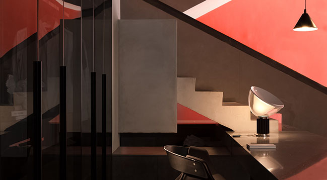
In order to enable more interaction between light and the interior, daylight openings are positioned strategically in the space and are supplemented with greenery. The solid wall next to the staircase was changed into a "wall + glass" structure, which allows natural light to better flow into the space and also visually extends the striking coral red color of another wall beside the stairs by reflection of the glass.

Continuation of the sense of architecture
As approaching the interior, the design team not only focused on binging in nature and optimizing the comfort of space, but also worked to enhance flexibility and interweaving in the interior by adopting architectural thinking.
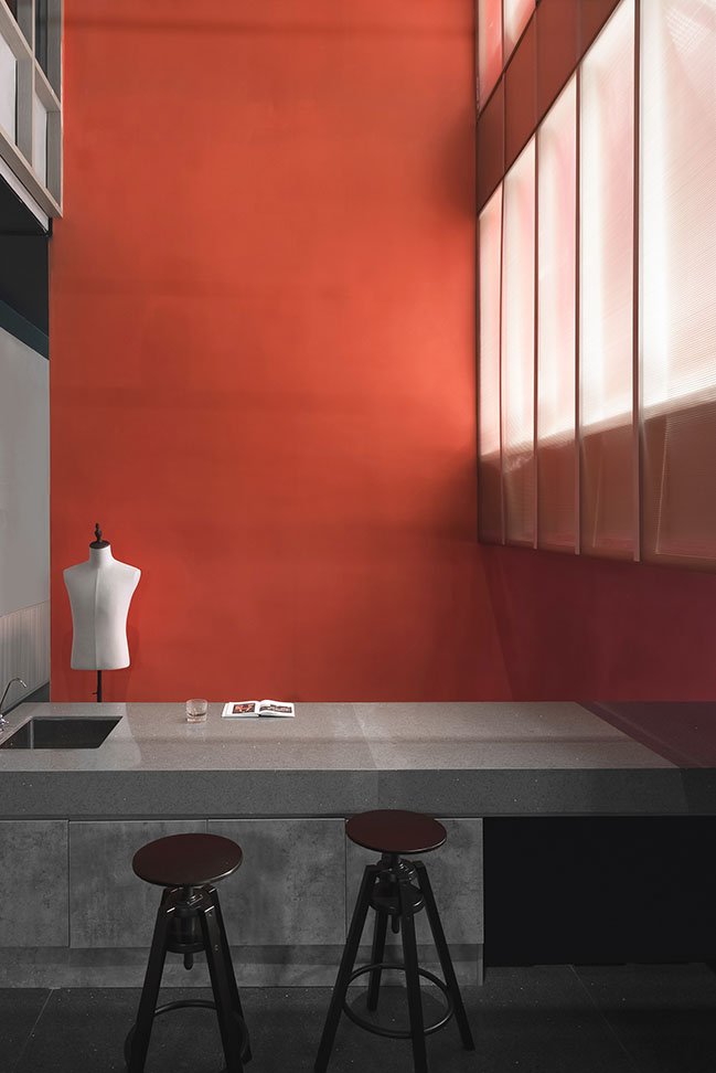
The old gray and white staircase was renovated, with a simplistic marble slab penetrating it horizontally. The reception desk and the water bar area respectively at the front and rear of the staircase are connected, together forming an L shape that extends all the way to the void space behind the stairs. The front desk, the pantry, the operation desk and the negotiation area are linked in a smooth and playful way, which brings people closer to each other.
The stairway and the wall surface in the hollow space are clad in the same coral red paint as the building facade, which extends the sense of architecture from exterior into indoor space whilst blurring the boundaries between interior and exterior.
Through creating landscape, adjusting the relationship between the architecture and its surroundings, coordinating interior spaces as well as establishing dialogue with nature, Masanori Designs reshaped the client's brand image and enhanced its brand power, which enables every B2C company owner who comes to visit to feel a familiar sense of brand.

YOU MAY ALSO LIKE: Star Garment Innovation Center by JPDA
YOU MAY ALSO LIKE: His house and her house: Urban village renovation by Wutopia Lab
YOU MAY ALSO LIKE: MAD reveals a renovation proposal for Montparnasse Tower in Paris
Chengyuan Garment Office Building by Lucien Organization - Masanori Designs
04 / 13 / 2020 This project is the renovation of an office building in the headquarters of Chengyuan Garment, approached by Masanori Designs
You might also like:
Recommended post: Shell House by Lenz Architects
