06 / 17
2022
Tucked into a steep hillside lot in Bel Air, the 14,000 SF House on Siena Way tested our firmly grounded modernist principles...
> SPF:architects completes a Bronze House on Nightingale
> SPF:a completes renovation of 1970s Jerrold Lomax residential design
From the architect: This project underwent several ownership changes since we were first brought on in 2013. Despite the moving target of changing stakeholders and client interests, and with three full designs produced, the main goals of the project never changed, namely: to resolve the challenges of the difficult site in an elegant way, deliver sufficient square footage despite onerous building height limitations, and provide both an intimate family setting and expansive entertainment abilities for the future residents.
Abstract Geometry
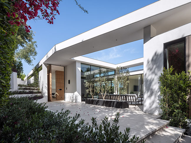
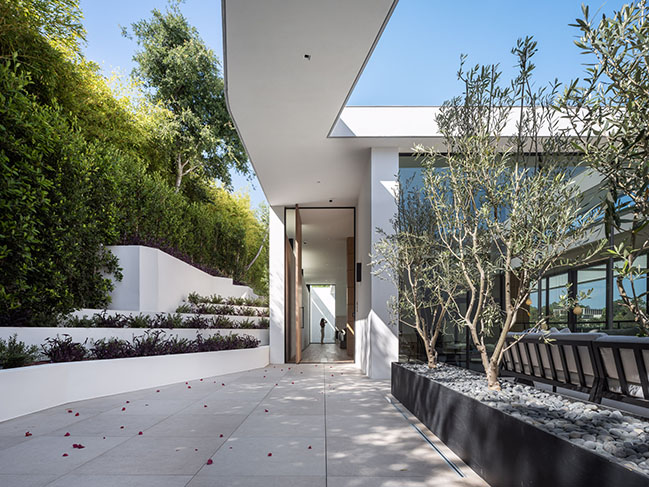
The project, located in Bel Air, presented many challenges including the site’s steepness, narrow street frontage, neighbor-imposed building height restrictions, and difficult vehicular access. An atypical building shape and plan was required to deliver the home that the investors wanted to bring to market.
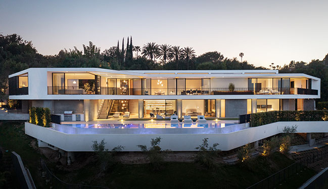
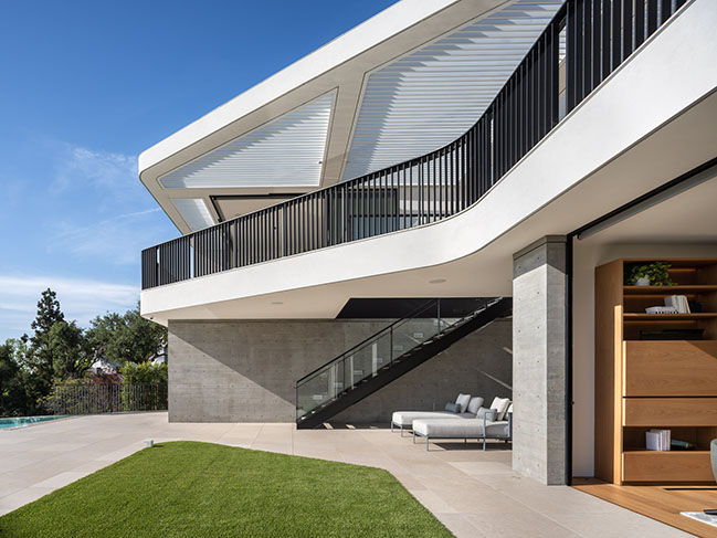
We decided that the best solution was to react to the site in a literal way. By following the natural contours of the site, we maximized the plan, pulled the building down into the site, and stepped the massing to follow the topography. The result is a non-definable curvilinear form, still abstracted in architectural geometry, but with a more fluid and organic shape.
Light, Play, and Nature
Like with our Bronze House on Nightingale, a specific height restriction dictated by the neighbor limiting the structure to one story above grade meant we had to dig deep into the site to unearth the needed additional square footage required for the development to be feasible financially.
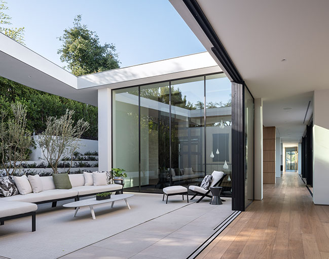
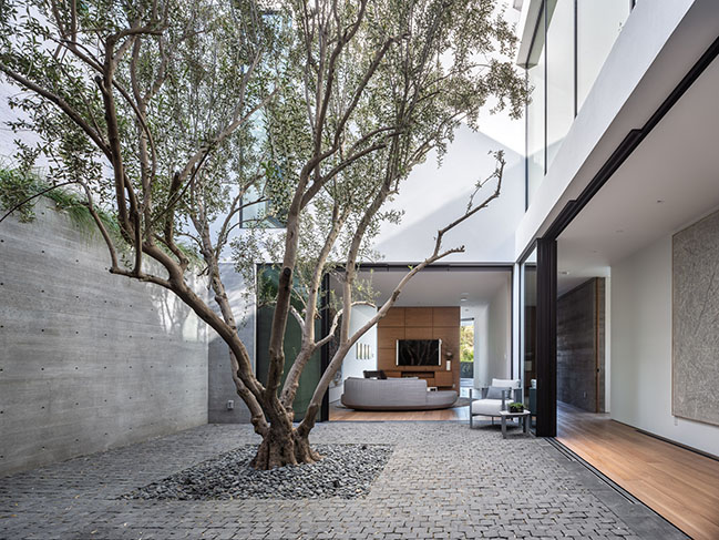
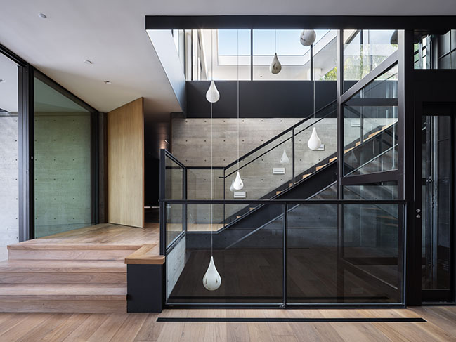
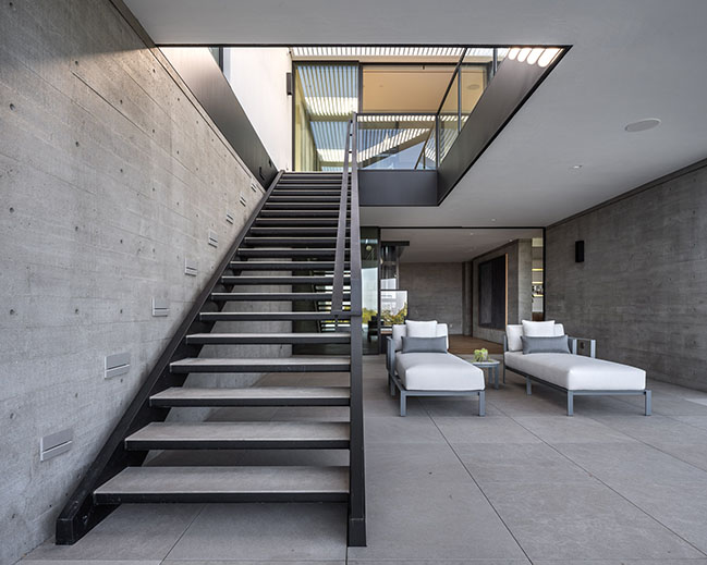
The challenge, then, was in bringing daylight down to the lower levels. Two large light wells, one with a monumental stair and glass elevator and one that acts as a sunken court with a sculptural olive tree create the required daylight and ventilation making the lower levels pleasing.
The courtyard not only provides daylighting but brings nature to some of the most frequently used areas of the house. From the entry level’s living room, dining room, and master bedroom, the tree’s crown fills the visual experience while the gym, the hallway, and the mini-master bedroom below experience the sculptural olive’s trunk.

14,000 SF of Intimacy
Although the home appears relatively modest from the street, it is secretly expansive. We worked to avoid the mistake of producing a home that feels cold and vast. Our aim in designing any residence is to enable future inhabitants to feel comfortable in all circumstances: whether they are hosting a large fundraising party or enjoying an intimate family dinner.
The plan’s organization was reversed from the traditional approach. The entry-level consists mostly of ‘public’ spaces: the living room, dining room, kitchen, and an expansive 20-foot-wide shaded deck overlooking the Bel-Air Country Club. A level down, the mini-master, three bedrooms, den, and the lower entry open to a large cantilevered lower deck with a trapezoidal-shaped swimming pool.
A Return to Stucco
In order to resolve the complex geometries on the exterior of the house, we did something we have not done in a long time - we worked with stucco.
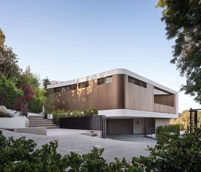
The unfortunate proliferation of stucco homes and buildings in Los Angeles is as well documented as it is vapid. It should go without saying, then, that we generally avoid its use. However, in this case, due to the curvature of the house, we revisited stucco as a facade solution and were pleasantly surprised with the results. Requiring very few joint lines, the stucco looks almost monolithic, pairing well with the bronze-painted aluminum slats found on the exterior.
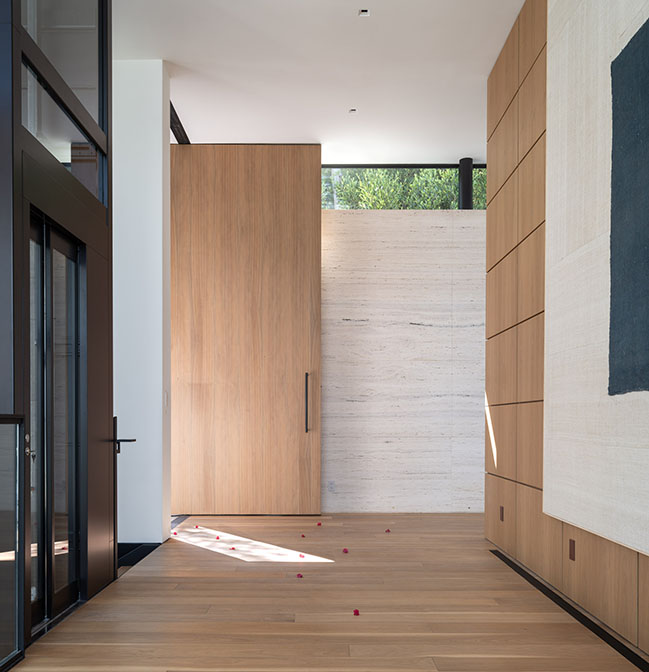
Uniting the interior is a restrained palette and consistent finishes: walls are white and floors are walnut, as is the wall paneling. The stone throughout is light beige, a color that is repeated in the travertine entry wall. Large amounts of glass with black anodized aluminum frames allow ample light and ventilation into the home.
Striking a Chord
Despite having a more dynamic and fluid geometry than our typical work (the plan is multi-axial: relationships or 'lanes' are turned, rather than straight), the house is still set up on a strict 20-foot grid - a theme we find ourselves returning to consistently in residential architecture.
“Any project we do I start with a structural system, often repetitive and rigorous that allows bedrooms and other basic rooms to fit well spatially. To me, there’s beauty in this rational approach. It is where I find peace and solace… a structural system that’s expressed in the building. You see it in the columns, in the steel, in the concrete, in the rhythm of the house... To relate it to music: we find a chord we like - one that sounds good, and we repeat it often.” - Zoltan E. Pali, FAIA | SPF:a Co-Founder & Design Principal
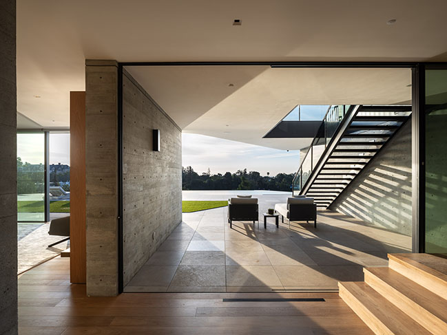
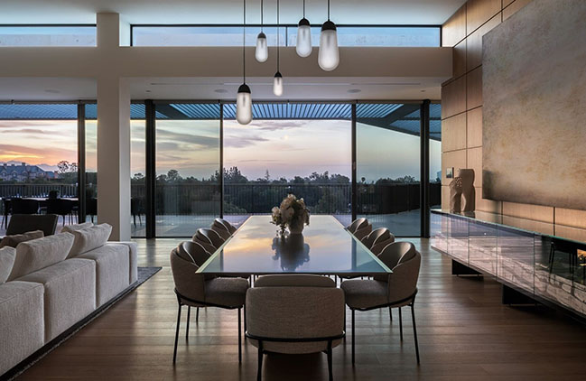
House on Siena Way, Bel Air by SPF:architects
06 / 17 / 2022 Tucked into a steep hillside lot in Bel Air, the 14,000 SF House on Siena Way tested our firmly grounded modernist principles...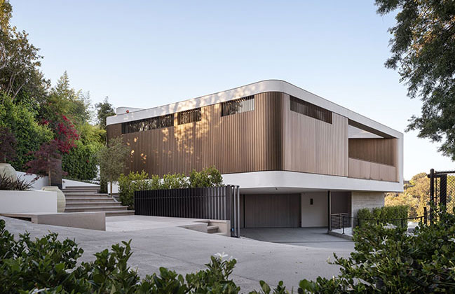
You might also like:
Recommended post: Rooftop penthouse in Sydney Australia
