06 / 30
2021
The project interconnects all the spaces and usages giving a prime rendition to the client’s emotional connection to Venice through the enhancement in the colors, fabric, furniture and their beautiful Murano Glass Collection...
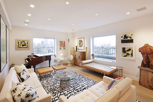
From the architect: In January 2018, I had the pleasure to meet two new clients, a media entertainment executive and her husband,a psychiatrist. They had recently purchased a wonderful piece of heaven on the Penthouse of a West End prewar building. We met at their newly acquired apartment, where they showed me a preliminary design prepared by the Architect of record (Koutsomitis Architects), a small architectural firm they had engaged to prepare a somewhat small renovation. They felt something was missing in that initial design, and they hoped I could bring a different design strategy to their home, introducing a holistic approach that could interconnect all the rooms and uses. That way, we agreed I would be the Designer of their new residence, and what started as a small project ended up becoming a gut renovation.
On that first cold but crisp winter morning, while we stood in a light-flooded dining room, we talked about their expectations, needs and their emotional connection to Venice. It seemed clear to me their Murano Glass collection would need to have a prominent presence in their new home.
I soon discovered their love for Italy and learned that they have a pied a terre in Venice where they spend countless days enjoying the Art Biennales, Opera shows at La Fenice, movie days at the Venice Film Festival and diners with their local friends in the less traveled restaurants of the city. The Venetian culture is present in their taste for colors, fabrics, glass and furniture.
They knew me through Magazzino Italian Art, an award-winning museum an hour North of the city, and they were attracted to the simplicity of its design. Their apartment project represented a challenge to marry my restrained design with a more sumptuous and colorful Venetian palette.
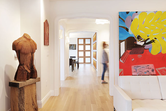
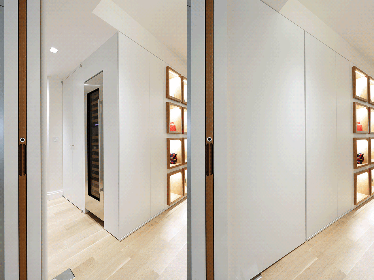
My layout had two critical elements. On one side, I wanted to make a clear distinction between the public and the private spaces of the apartment. That way, the bedrooms would “hide” behind a “secret door”, a 10-foot floor to ceiling pivoting frameless panel. On the other, the public space needed to be recognizable and strongly marked by one axis. Therefore, I was convinced the arched entry to the living room needed to shift a few feet to mirror a twin arch leading to the dining room. The husband was slow to embrace this idea, but once convinced became fond of teasing me as we walked visited the job site, “And may I point out a central idea of this renovation . . .” This single action allowed us to create a free-floating public space from the North to the South end of the apartment, and it also helped add more privacy between the vestibule and the living room, adding a prominent art wall.
The idea of moving the living room arch will be one they will enjoy telling their visitors. It took me two months to convince them to do it, together with endless phone calls, meetings, conversations with their friends and relatives, floorplans and renderings. The second most discussed design element was the dining room millwork piece. I wanted to give their beautiful Murano glass collection the prime presence it deserved.
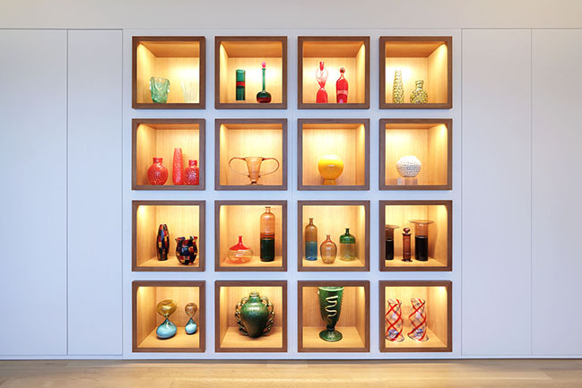
Therefore, I conceived a white, silent full height furniture piece acting as a background that would showcase 16 light oak wood boxes that would host their most significant pieces. I worked closely with my lighting designer to provide the most inconspicuous LED lights available to yield the best color rendition.
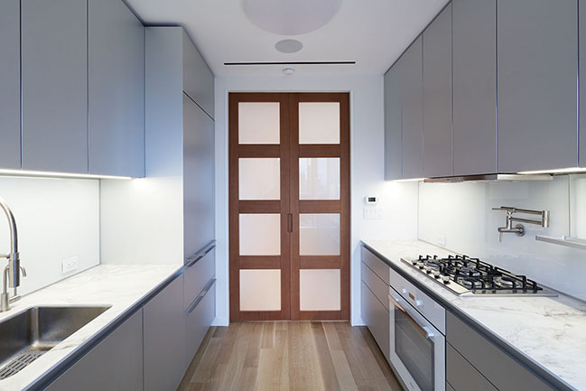
The entrance to the kitchen was aligned with the two arches to maintain the unity of the design. I decided to use pocket doors leading to the kitchen; that way, when large diners occur, the kitchen can be kept behind closed doors. Otherwise, it is incorporated into the overall public space when they have informal gatherings or are by themselves. These doors were conceived in the same light oak wood specified for the wood “boxes” and used frosted glass in square patterns, mimicking those boxes’ proportion. To reinforce the idea of a single space and take advantage of the considerable depth of the North/South axis, the new oak floor runs end to end without any thresholds, even on the kitchen floor. After boundless conversations about hardwood patterns and finishes, we agreed on a wide plank and natural finish that extends throughout the whole apartment.
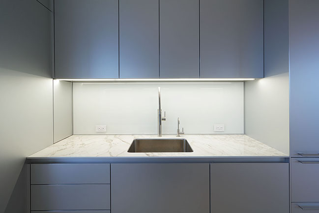
The kitchen design seemed simple as it was split into two long countertops along the East and West walls, while the Northside had a door to the terrace that will allow for many meals “al fresco”. The layout had to deal with three existing risers that the building would not let us relocate; therefore, some of the challenges came of making as much working surface as possible in a jagged room. The German-made Bulthaup cabinetry allowed us to select an aluminum finish paneling that reflects/mirrors the light, flooding the room, that works well with the maintenance-free countertop and the neutral frosted glass backsplash.
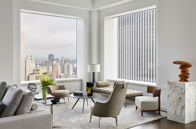
I repeated another element throughout the apartment: the white window sills (conceived with a slight lip overcoming the walls). In some instances, in particular the living room, they become frames that objectify the magnificent city and river views. That same solid surface material became my choice for other accent items throughout the apartment (shower pan, master bathroom floor and vanity).
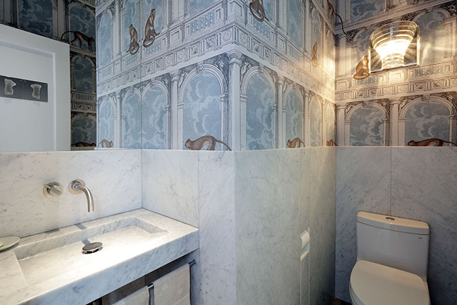
The Powder room presented the challenge of dignifying a very narrow space with a stained glass window. I proposed to minimize the number of materials to use, and after a couple of visits to stone suppliers with them, I favored the Carrara marble we ended up using on walls and the sink. I agreed to use a mosaic floor with the condition it would not have a pattern; the result is a neutral light gray floor that enhances the marble. The skillful stonemason was able to use full 2’ by 4’ slabs as a wainscot in such way you can read the thickness of the slabs on its top edge. The Fornasetti wallpaper was a concession to the wife, who fell in love with it, and the color pallet was a perfect match to the light gray tone of the room.
As the client/architect relationship progressed, our relationship evolved into a friendship. In 2019 I was lucky to share a week in Venice with them, visiting museums, art galleries, glass stores and learning from Scarpa’s masterful work. It was in that trip, during a visit to the Prada Foundation to see a retrospective on Jannis Kounellis, that we saw “Tragedia Civile”. This 1975 work showcases a magnificent contrast between a gold leaf wall and an item of black clothing hanging from a coat hanger. I suddenly knew how to give the second bedroom its very own character.
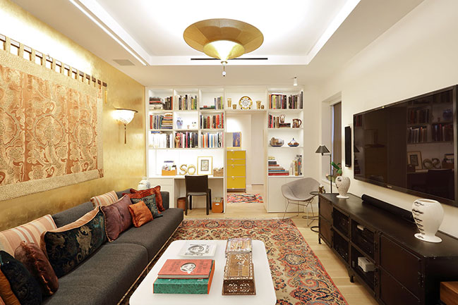
This room, which doubles as a TV room and a Guest bedroom, has two small windows facing North. I decided to have the opposite wall covered in a gold-leaf like wallpaper that brings a glow to the room. The West wall becomes a built-in library/work station that hides a sliding door (to express this room’s different character). The furniture is abundant and rich; the pendant light, the wall sconces, a fabric wall hanging (all by Fortuny) and the art bring a Venetian feeling to the room. In contrast, the guest bathroom recuperates a more subtle language and incorporates long thing porcelain tiles (6” by 36”) that bring a horizontality to the space; all the elements in the room (plumbing fixtures, medicine cabinet and soap shelf adhere to that 6” module.
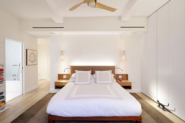
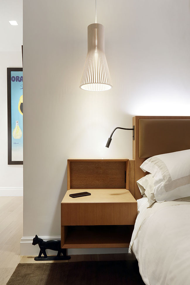
My priority for the master bedroom was to create a peaceful quiet environment with a minimum number of elements. The existing conditions included a gorgeous sliding door facing South, with imposing views of downtown Manhattan. Every decision would have to contribute to it (the placement of the bed, the storage or the not-so-desired bedroom TV). Their need for storage required closets in addition to the walk-in closet. Therefore, the East wall houses a full width, with floor to ceiling custom flat doors that create a blank background. The client wanted to bring their existing bed frame, but they did not have a proper headboard. This represented an opportunity to plan a bedroom element with the same oak finishes and language of the dining room piece but customizing the piece to the particular needs of the master bedroom (custom night tables, reading lights and indirect lighting) were carefully designed.
The Master bathroom has a small footprint and the white color (that helps the light to bounce) and reducing the number of joints on floor and walls helped to perceive a wider space. The millworker and mason’s mastery allowed a beautiful custom vanity in the same material as the floors, and the clear shower glass creates a continuous length. The quartz-based solid surfaces on the walls provide a maintenance-free marble looking background, and the stained glass window creates a playful color contrast on the white floors.
One of the most gratifying experiences was indexing their art collection and learning which pieces were dearer to them and should have a prominent display in their new home. We were able to start the catalogue at the beginning of the project, which allowed me to think of the project’s overall experience, in particular, to allocate several pieces in focal points.
Therefore, as you arrive in the elevator lobby, three beautifully illuminated facades of Venetian buildings welcome you as if they told you, welcome to a bit of Venice in New York. As you open the door to the apartment, you see a beautiful photograph of a fruit tree by Israeli artist Tal Shochat. This dark square piece hangs on the wall that used to be the arched entrance to the living room. Their four colorful David Hockney prints were destined to be displayed in the public area; therefore, I chose the living room’s long East wall. The North wall of the same room hosts “On wings of Matisse”, an impressively large size (78” by 83”) painting by Shai Azoulai.
The final aspect of the design was assessing their existing furniture (much of it classic mid-century modern) and laying out the different rooms, as well as advising them on some new pieces (the playful Fornasetti cabinet in the dining room or the yellow bright USM Haller chest of drawers in the bedroom foyer). For me, it was very exciting discovering a beautiful dining table by Carlo Scarpa that not only filled the dining room, it actually enhanced the space thanks to the rectilinear brass frame and its glass top. Ultimately, we were able to compromise between a rich and abundant number of pieces and my tendency to outfitting just the essential things. The balance makes a gorgeous, cozy and modern home that shows my design principles while sharing the dwellers’ taste and influences.
Architect: MQ Architecture
Location: New York, USA
Year: 2021
Built area: 2,000 sq.ft.
Design Architect: Miguel Quismondo, AIA
Architect of Record: Koutsomitis Architects
Collaborators: Miguel Bello, Jorge Monzonis, Jacobo Mingorance
Lighting Consultant: MAP Design Studio
General Contractor: Vlora Design
Millwork Contractor: Lucenti Interiors
Photography: MAS Photography
YOU MAY ALSO LIKE: Modern Gastown Penthouse by PlaidFox
YOU MAY ALSO LIKE: L.S House | The Southern Penthouse by Moran Gozali
Upper West Side Penthouse by MQ Architecture
06 / 30 / 2021 The project interconnects all the spaces and usages giving a prime rendition to the client's emotional connection to Venice through the enhancement in the colors, fabric, furniture and their beautiful Murano Glass Collection...
You might also like:
Recommended post: Lawes St Extension - Hawthorn by Habitech Systems
